
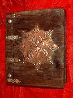
One of my better cover treatments, featuring hand tooled sheet copper and flame-aged wood. The copper was patinated with a mixture of ammonia and salt water.
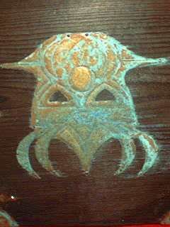
A closeup of the cover embossment. The copper was attached to the cover using brass brads.
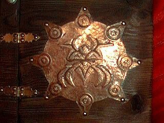
An alternate cover embossment using un-aged copper. The Cthulhu sigil on the cover was one I came up with while trying to mimic some of the design elements of art from the South Pacific using the tribal-styled Tatooz font. Most of the artwork rearranged bits and pieces of that font to create the dozens of illustrations, such as they were, that I needed to fill the book.
This shot gives you a look at the the alternative binding I used for a few copies.

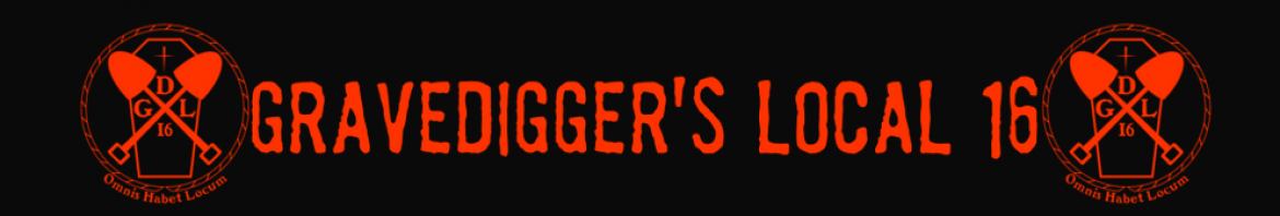
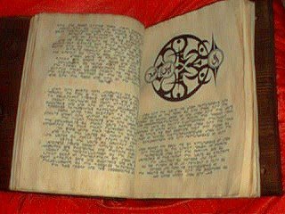
Interior pages, with a good shot of the Cthulhu sigil. As you can see, the pages had a very light aging treatment. That tendency to under-weather props is something I’ve had trouble with for years because of my fondness for neatness and cleanliness. It’s not quite at the level of suffering from OCD, but it’s definitely had a negative impact on my propmaking efforts.
I need to embrace the dirt. Heh.
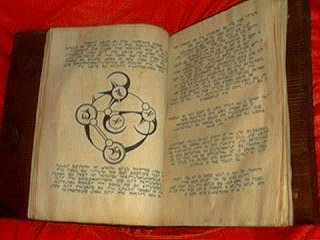
One of the summoning circle designs.
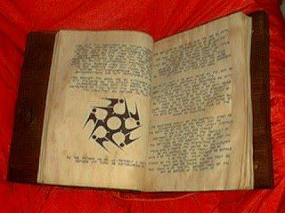
I believe this was the Dagon sigil.
Another summoning circle.
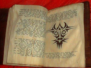
I can’t even remember what this one was supposed to be.
With the distance of time I can see a lot of flaws in these, but I think that overall the Scriptures project was a decent effort. The biggest problem with it is that most of the illustrations are only mildly reworked and recombined symbols from the Tatooz font, something that I’d be loathe to do today. There’s a line between inspired and derivative that this project’s artwork definitely crossed.
The weathering treatment is also far too light. As I’ve done more prop artifacts over the last few months I’ve grudgingly begun moving towards adding more extreme distressing to items. I’ve even posted a sign saying “More Dirt! More Grime! More Wear!” above my workbench as a motivational tool. I know it sounds weird, but it takes a major effort for me to really dirty things up the way they should be. I know intellectually that they’ll look better that way, but my innate psychological aversion to dirt seems to apply even to fake filth.
This article originally appeared at Propnomicon.

This work is licensed under a Creative Commons Attribution-Noncommercial-Share Alike 3.0 Unported License.
Gravedigger’s Local 16 is not to be held responsible for the content on or anything that may occur (be it good or bad) as a result of visiting any links (or constructing a project that’s detailed on them). Attempt at your own discretion.